Storytelling for buildings: Why real estate branding matters
November 26, 2024
November 26, 2024
A strong brand can help set a property apart. Here’s a look at 4 brand-focused properties.
A version of this blog first appeared as “Storytelling for buildings” in Design Quarterly Issue 22.
In today’s market, real estate branding is no longer a luxury reserved for high-end properties. It’s a necessity for success. The built environment—offices, apartments, retail spaces, schools, and mixed-use neighborhoods—often requires more than just thoughtful design and a prime location to succeed. To create a meaningful connection with the communities they serve and engage users, places need compelling identities. They need a story that resonates and a promise that differentiates.
That’s where branding comes in.
What is effective real estate branding? It can come in many forms. Thoughtful branding shapes perceptions, drives engagement, and adds lasting value. Successful real estate branding can play out in the built environment in several ways, from increasing presence and position in the marketplace to boosting a feeling of belonging within an organization or community. A compelling real estate brand lays the groundwork for a property to leverage hundreds of touchpoints to appeal to its users and separate itself from the pack.
Multifamily residential is an industry where first impressions are paramount, and competition is fierce. A strong brand can be the decisive factor that sets a property apart.
Our frequent client and collaborator Noel Carson, vice president of marketing and creative director at Bozzuto, says it best: “The best brands are responsive and they’re able to flex and bow. They have a wide enough kit of parts that can be used to market the asset across a myriad of channels—including web, social, events, and print. When done right, it creates brand love for the property, ultimately bringing value to our clients and an apartment brand that is connected to the consumer.”
As a branding studio specializing in real estate, we often work in tandem with our architects, planners, and interior designers. Our goal? To collectively create distinct and memorable places. The resulting projects vary just as broadly as the brand identities themselves. Here’s a look at four of them.
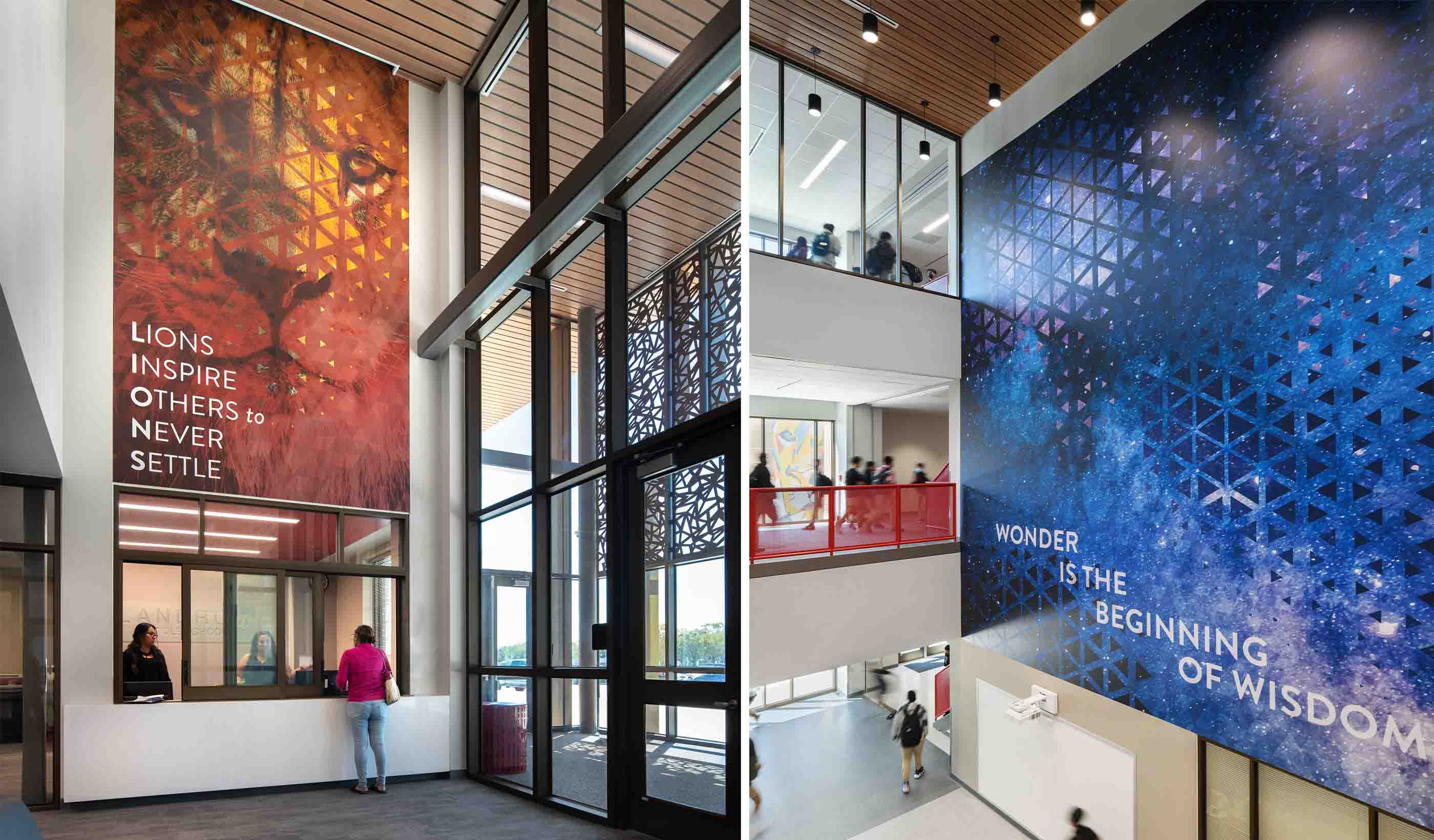
Landrum Middle School: When our team was tasked with creating the new Landrum Middle School in Houston, Texas, our goal was to reorganize and modernize the campus. We also wanted to pay homage to the school district’s history, values, and beloved mascot, the Landrum Lion. Our real estate branding team came in to develop visuals that would foster pride and encourage learning.

Part of the real estate branding process at Landrum Middle School in Houston, Texas, was a focus on the school’s mascot—the Landrum Lion.
Branding: Our real estate branding team fused the interior design concept, the desires of the school district, and the district’s existing branding to create visuals that serve as both artwork and inspiration. The team created two large external graphics for the building’s façade. The graphics reimagined the school’s mascot—the Landrum Lion—into iconic art. Inside, our team created large-scale art pieces. They incorporate geometric patterns, meaningful quotes, and references to natural phenomena that embody the idea that “wonder is the beginning of wisdom.”
Benefit: The result is an engaging learning environment that reflects Landrum’s pride in its mascot, while also encouraging its students and staff to dream big. The multi-panel, larger-than-life lion mural in the public courtyard has become the school’s iconic epicenter. It’s the place where students and staff take milestone photos with the mural as the backdrop.
Southline: We use real estate branding to transform properties into places with unique identities. We employ branding to highlight a property’s appeal and to make it a unique experience. When done right, it will foster emotional connections and enhance tenant satisfaction. Our team of architecture, interior, and experiential designers helped breathe new life into the former headquarters of The Boston Globe in Boston, Massachusetts. We envisioned the 16.6-acre site as a modern hub for creative offices, laboratories, and retailers—a vital “genius factory.”

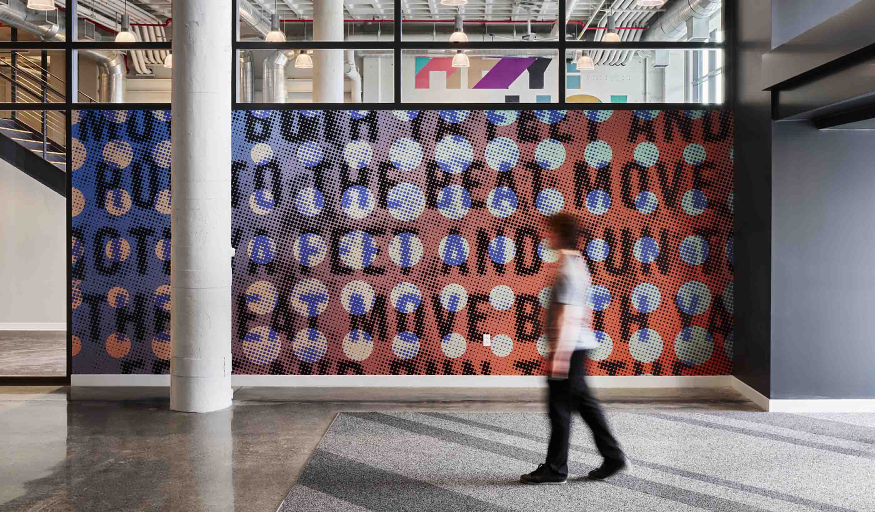
Breathing new life into the former headquarters of The Boston Globe, real estate branding was key for the Southline project in Boston, Massachusetts.
Branding: We used two primary concepts in a distinct visual identity throughout the property. The first pays homage to the printing presses that once ran here. Prominent graphics use letterforms as art, echoing the halftone textures of newspaper printing. We crafted large floor numbers at elevators from a halftone pattern of CMYK dots. Restroom identifiers feature collages of newspaper clippings and letterforms.
The second concept was inspired by synesthesia, a condition where people perceive colors when hearing music. We expressed this in bold colors and dynamic patterns to suggest energy and modernity. Branding seamlessly integrates the property’s marketing tagline “make some noise” in floor-to-ceiling graphics, while snippets of song lyrics adorn the walls.
Benefit: The reimagined facility, known as Southline, stands out among Boston’s office spaces. Beyond its storied history, it offers a range of exceptional amenities, including a food hall, roof deck, indoor basketball court, and a charming newspaper truck-turned-lounge. Distinctive brand graphics enhance the ambiance. They give the building its unique identity. And they’re helping to attract diverse tenants and providing clear wayfinding throughout the 750,000-square-foot campus.
Emblem 120: Multifamily residential is an industry where first impressions are paramount, and competition is fierce. A strong brand can be the decisive factor that sets a property apart. This means telling a story through multiple touchpoints—everything from its name to its artwork—to create an emotional connection. Emblem 120 is a new apartment community in Woburn, Massachusetts. It honors the town’s industrial heritage while offering modern residences within a five-minute walk from the commuter rail.

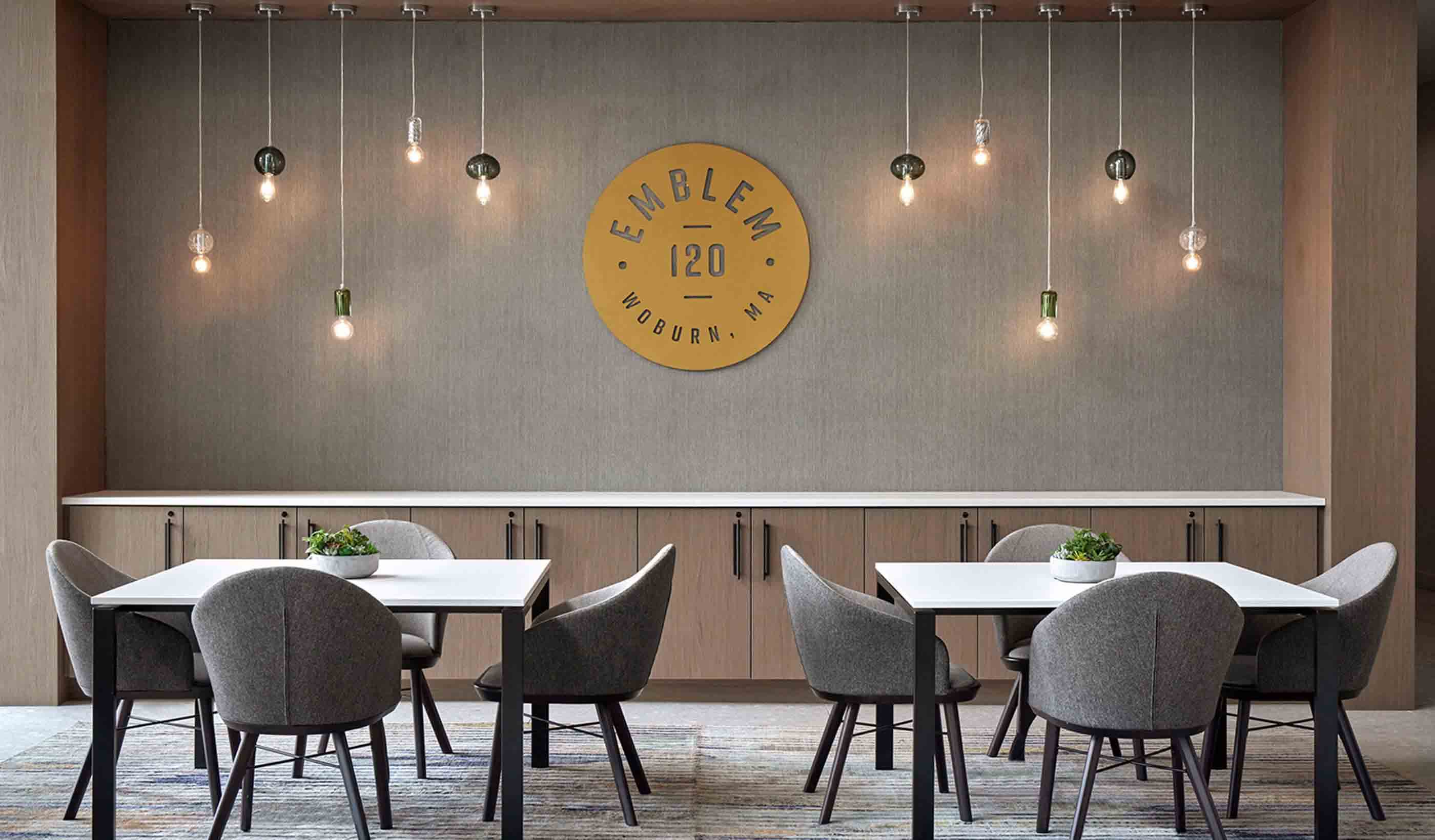
Emblem 120 is a multifamily residential property in Woburn, Massachusetts, with a brand that is built around the “Made for the Journey” tagline.
Branding: Our real estate branding and interiors teams developed a concept and tagline—“Made for the Journey.” It references both the neighborhood’s manufacturing history and its access to public transit. The property brand, interior design, custom artwork, wall coverings, and signage design all work in harmony to support this concept. We brought the environment to life.
The “explorer’s wall,” spanning the double-height lobby space, showcases famous journeys—from Voyager 1 to the Boston Marathon—in inspiring images. In the fitness center, motivational custom wall coverings emphasize the property as a launching point for life’s journeys. The walls feature graphic patterns that merge directional motifs, GPS coordinates, and emblems showing the number of steps to renowned destinations.
In the coworking pods, custom wall coverings celebrate the town’s history through patterned duotone images. Local history is woven into the property finishes. Thick-stitched, leather-wrapped columns. Blackened steel beams in the lobby. Die-cut bronze signage in the concierge area. They all add to the building’s brand.
Benefit: Choosing where to live is emotional. When real estate branding and interiors align to create a unique sense of place and a compelling story, potential residents are more likely to feel a positive connection. Well-branded properties become more memorable and are viewed as more desirable. Emblem 120, with its cohesive and inspirational branding, is succeeding. More than 90 percent of its units are leased.
Flyway: A new mixed-use destination is being developed between vibrant Houston and sun-drenched Galveston, Texas. Our Urban Places and Branding teams helped craft an authentic and enticing vision for the development. Our goal? To attract top-tier retailers and the public.

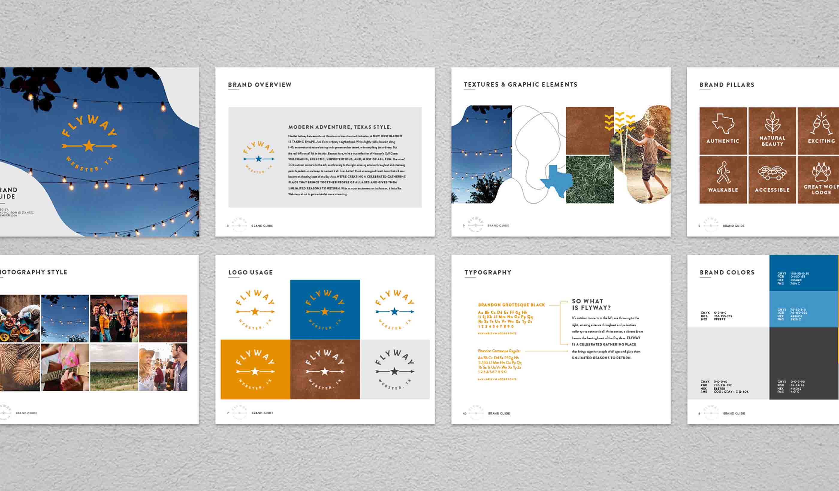
At Flyway in Webster, Texas, the mixed-use destination’s brand and logo extend throughout the neighborhood. It serves to celebrate local culture, the site’s natural beauty, and contemporary energy.
Branding: Our real estate branding team presented the neighborhood committees, government officials, and other stakeholders with more than 20 potential names for this new destination. We sought a name that resonated with local culture and highlighted the area’s unique characteristics.
The selected name—Flyway—draws inspiration from the nearby Lyndon B. Johnson Space Center and the nearby migratory bird route. The brand and logo extend throughout the neighborhood and serve to celebrate local culture, the site’s natural beauty, and contemporary energy. This cohesive approach helps every element of Flyway, from signage to promotional materials, to align with the overarching brand vision. All consultants adhered to the brand standards in their use of language, graphics, and brand attributes.
Benefit: Flyway’s real estate branding created an authentic identity that resonates with the community and visitors. Anchored by Great Wolf Lodge, the development has secured deals with sought-after retailers.
Integrating design and messaging through environmental branding brings special buildings to life.