Shrinking space: Post-pandemic law firm offices are smaller and more communal
January 11, 2024
January 11, 2024
Cafes, huddle spaces, and hybrid work are replacing the huge corner office for many attorneys
While there has never been a one-size-fits-all approach to designing for a law firm, there was generally a degree of consistency—a sense that there was a certain way of doing things. One did not easily deviate from that track.
Partners had the big corner offices. And the best views. Abundant private offices lined the perimeter. These were flanked by paralegal and legal secretary desks. The hours were generally long, and everyone was in the office all the time. Firms were always curious what their competitors were doing, but they weren’t in a hurry to be the first to make big changes.
Then everything changed overnight. COVID-19 forced it. Firms that would never have considered allowing a work-from-home policy found that it worked. Other firms struggled with remote work and returned to the office as quickly as possible.

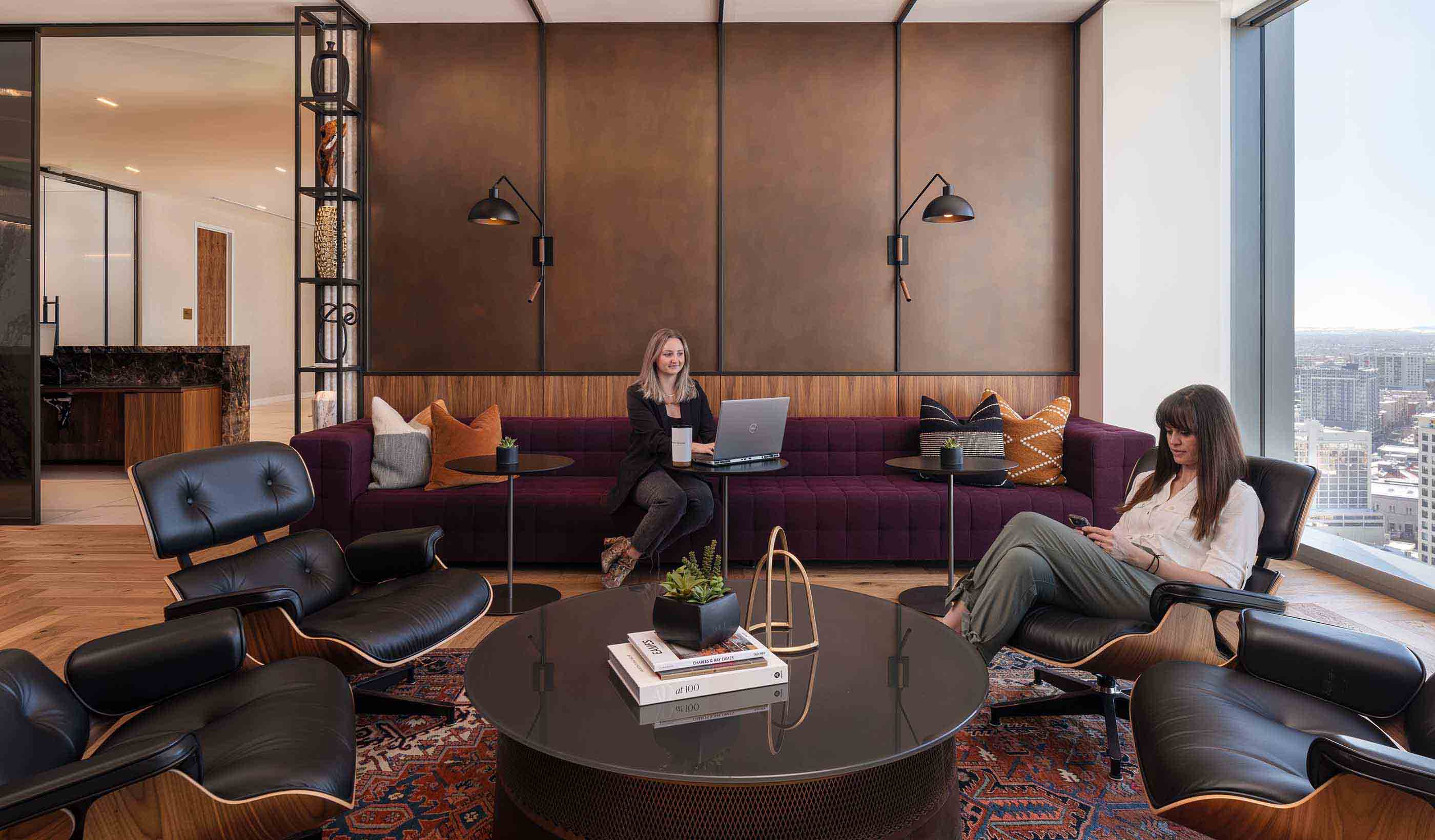
The pandemic caused many law firms to rethink the purpose of their office space. It has resulted in offices like this one at Haynes and Boone in Denver, Colorado, that feature lounge spaces.
Whether they returned immediately or not, we saw law firms broadly rethinking the purpose of their office space at a level impossible just a few years ago. The result? Upending of the traditional model for law office design. While there are some common themes in the changes taking place, from smaller footprints to a greater focus on technology and flexibility, there is now a wider variance than ever before in how these spaces look and feel.
Across the board, space has come under scrutiny. What do we truly use? Where could we eliminate unused or unnecessary space? These questions have led to a general trend across all businesses to use less square footage.
Historically, the average law firm office had from 800 to 1,000 square feet per attorney—a huge figure compared with the average of roughly 200 SF/employee. In recent years, we saw this reduced to 600-700 SF per attorney. At the same time, support staff moved from a 2-to-1 attorney-to-paralegal ratio to an average of 5 lawyers to 1 paralegal or support staff member.
Since the pandemic, that trend toward consolidation of the support model has sped up. We’re now space planning for several offices where there are up to 10 attorneys supported by a single team administrator. Now we’re looking at about 600 SF or less per attorney.
We recently helped Sherman & Howard move into a dynamic, amenity-packed new space in downtown Denver, Colorado. The office is 50 percent smaller than the firm’s previous space. While the firm has embraced a hybrid model, 72 percent of attorneys and paralegals still have an office. We found space-saving opportunities that include shared floating workstations, more collaborative huddle rooms, individual workspaces, and social areas—like a café and connecting staircase—to bring people together. We were also able to condense space in areas once viewed as a necessary part of law offices, such as a massive records room and library. We were even able to add in new trial prep rooms to the design. The result is that every square foot of space has a purpose and intentionally serves Sherman & Howard’s goals moving forward.

The new office design for Sherman & Howard in Denver, Colorado, intentionally supports mental and physical well-being with biophilic design features and ample amenity spaces for both lively interaction and quiet reflection.
For Denver-based Wheeler Trigg O’Donnell’s mid-pandemic remodel, the firm’s leadership elected to maintain offices for all employees as they had pre-pandemic. But they rightsized their spaces, going to a single-size office, and providing more opportunities for collaboration by changing the traditional corner offices into huddle rooms and adding a coffee bar. We reduced the total square footage by 25 percent and the spaces have been adjusted to better match what the firm wants and needs from the office.
Over the last few years, attorneys have learned to work—even thrive—in a variety of environments. Whether or not a firm has adopted a hybrid model, there is a growing recognition that productivity doesn’t depend on a desk and a private office.
For many firms, this is new. Outside the law industry, offices have adopted models that allow team members to work wherever suits them best. However, the often confidential and siloed nature of legal work has meant law firms have been slow to implement more flexible, collaborative models.
Now, we’re seeing work styles changing; they are becoming more agile, flexible, and dependent upon mentorship across generations. As a result of both the experiences of the pandemic and this general shift toward more cooperative work, it’s key to prioritize design that enables collaboration and connectivity everywhere in the office. Team members can meet over coffee in the café, touch down in a huddle room, or collaborate with a remote teammate or client in a dedicated Zoom room.
Spaces can also flex up or down as needed to provide what the firm needs. At Sherman & Howard, for example, we incorporated a variety of multifunctional flex spaces and café environments. These spaces provide lots of natural light and views, support large gatherings, and offer a second option for individual work away from the office.
Across the board, space has come under scrutiny. What do we truly use? Where could we eliminate unused or unnecessary space?
Providing choice and flexibility is not just good for productivity, it can help reinforce the value of the office. One of the central benefits of bringing people together in an office is face-to-face communication. Design that encourages people to move throughout the space provides employees with more than a change of scenery. It creates chance interactions and conversations that help build culture and boost purpose.
More than any other factor, we’re seeing the cultural values of the firm dictating what the office of the future will look like. And each culture is different.
At one end of the spectrum, you have firms that have embraced a flexible model. They believe their team can be productive in a variety of places but still want the office to provide the experiences that working from home can’t—camaraderie, connection, and a shared sense of purpose. The design of their office reflects these cultural values.
Some of these firms have shifted their office strategy to resemble more of a clubhouse. It’s centered around conferencing facilities, dining options, and a handful of private offices. The office is focused on the more social aspects of work, such as meetings with clients and collaboration with colleagues.

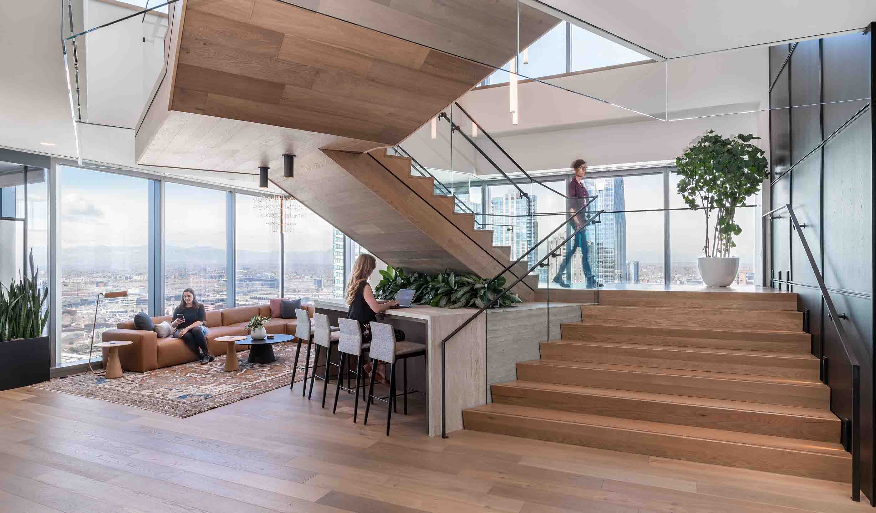
One of the key design elements in the Sherman & Howard law office is the connecting staircase between the firm’s two floors. It’s one of several social areas in the office.
At the other end of the spectrum, there are those firms that are keeping a more traditional model. Maybe their culture thrives on competition, going the extra mile, staying late, and coming in early. They were likely the first to return to the office en masse and see the office as a driver of productivity. The design of their office will reflect those values.
Working with a firm like this recently, one of our goals was to provide everything their lawyers, who tend to work individually, would need to be at their best. The design includes sit-to-stand desks, natural light, acoustic and visual privacy, and space to meet with clients or team members—all in a self-contained space. This client elected not to provide a shared amenity space because they wanted the emphasis to remain on individual billable work, which was happening in private offices.
Then there are those that fall somewhere in between. For Sherman & Howard, we created a design that emphasized culture and collaboration while still supporting the confidential nature of much of their work. They have fully embraced a hybrid work model and their office design reflects a paradigm shift in the way they operate now vs. how they operated pre-pandemic.
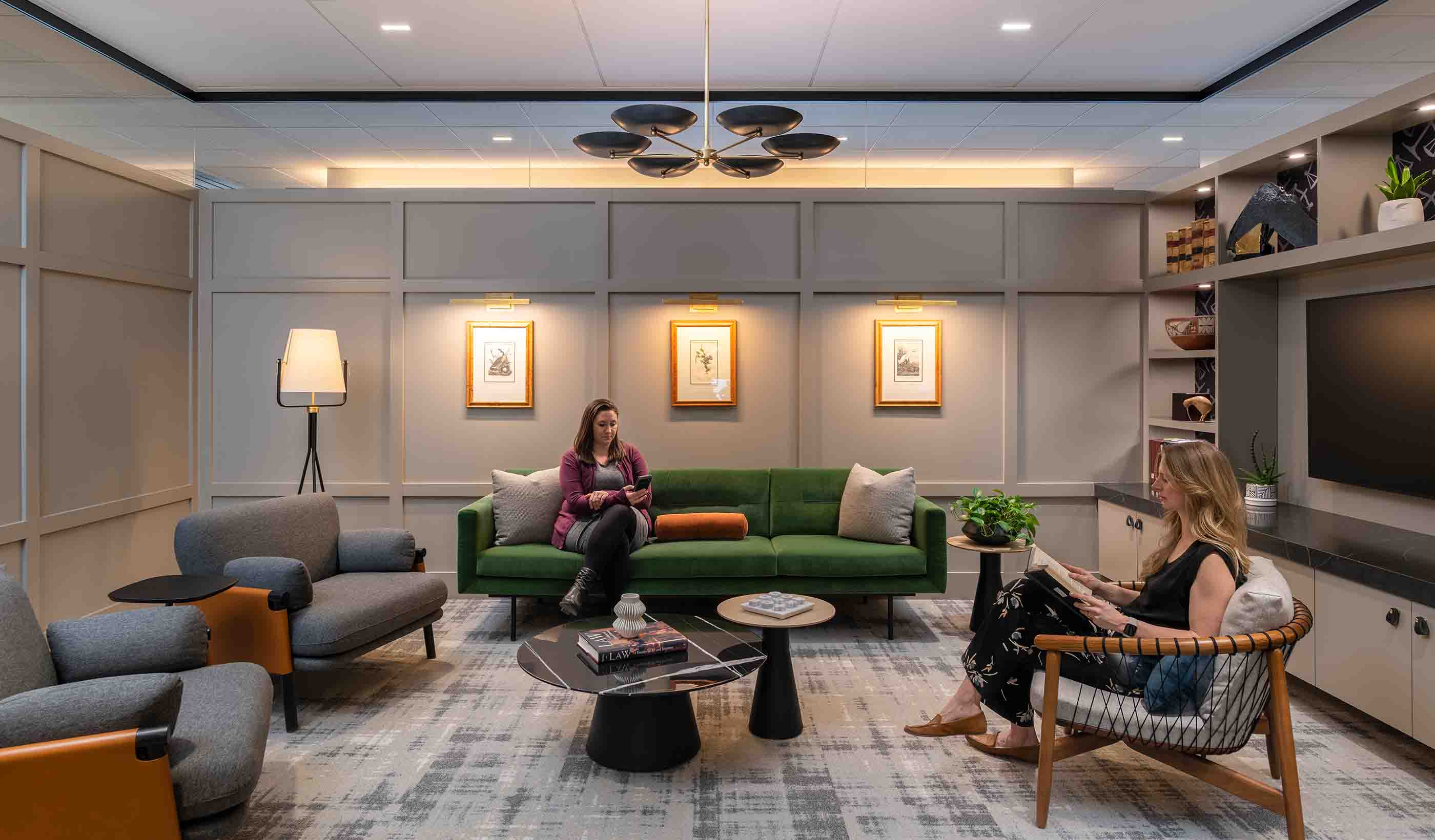
Sherman & Howard’s new design supports mental and physical well-being, with biophilic design features and ample amenity spaces. The typical “library” space has been reimagined into a lounge with curated tomes lining the area. Technology is integrated in such a way to provide parity of experience between those working from the office and those working remotely.
For Haynes and Boone, which is one of the largest law firms based in the US, we used some of their space standards from their offices in Dallas, Texas, to inform their new Denver office. The Denver team was given the flexibility to add spaces tailored to their culture here. With a growing team, the firm wanted a new top-of-the-line, yet welcoming, space that embodied their culture and character. We incorporated a beautiful lounge space and several collaborative areas that are unique to this office.

The new Denver office of Haynes and Boone is a top-of-the-line, yet welcoming space featuring sweeping mountain views.
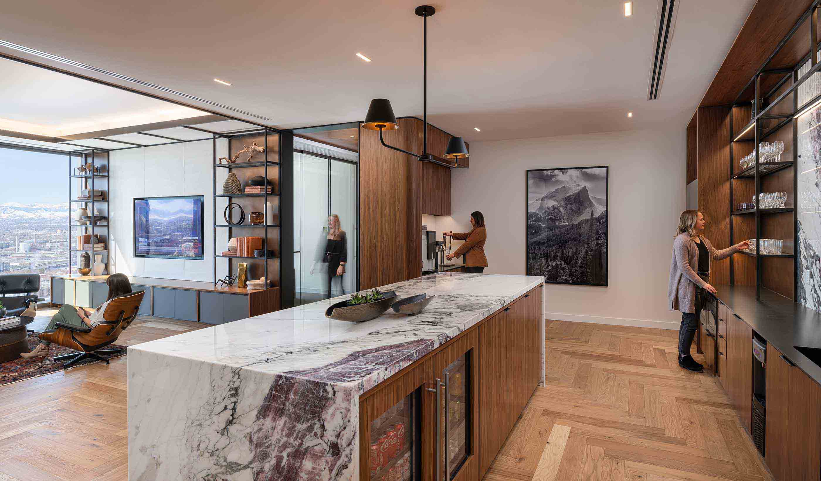
The Haynes and Boone space also features several conference rooms off the main reception that maximize the sweeping mountain views. The reception opens to a café and work lounge. Space along the perimeter windows was dedicated to this lounge versus additional private offices.
Ultimately, the events of the past two years have changed—and in many cases—broken the mold of traditional law firm design. Going forward, we will see design that is less dependent on keeping up with the Joneses and less reliant on the way things have always been done.
Instead, we will see highly customized environments. We will see firms experiment with space that is more directly tied to the firm’s culture and their view on the purpose of the workplace. And both firms and their people will be better for it.
A version of this blog was published in Building Design + Construction.